
HTML5
Design to Responsive Web Design

From Design to
Responsive Web Design

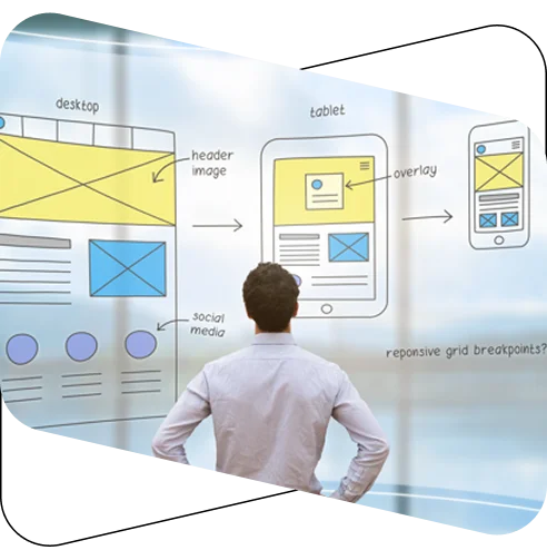
Convert your Figma, XD, Sketch or PSD designs into a fully responsive website that adapts fluidly across desktop, laptop, tablet and smartphone screens. ExciteMarkup builds mobile-first, pixel-perfect layouts using fluid grids, flexible images and modern CSS media queries.

Get a Free Quote
Figma
Responsive HTML Design Responsive WordPress Responsive Magento Responsive OpenCart Responsive Joomla Responsive Drupal
About the Service

The Most Trusted India
Based Design To Responsive Web Design Service Providing Company

Smartphones and other smart devices have changed the way people access the internet, with mobile now the primary way users browse the web. Our Design to Responsive Web Design service converts your Figma, PSD, Adobe XD, Sketch or Illustrator files into a single, fluid layout that adapts automatically to desktops, laptops, tablets and smartphones — no separate mobile site or app required.

Why Choose Us

Trusted for fluid layouts,
reliable delivery and
long-term support

Talk to sales

Clean HTML5/CSS3 code

Every layout is built with clean, structured HTML5 and CSS3 that is easy to maintain and extend.

Fully hand-coded markup

We hand-code every project instead of relying on auto-generated output, keeping the markup clean and reliable.

Fluid, responsive layouts

Fluid grids and flexible images keep your website looking sharp on desktop, tablet and mobile.

W3C valid, multi-browser tested

Markup is validated to W3C standards and tested across Chrome, Safari, Firefox, Edge and other browsers.

High-quality, SEO-friendly markup

We use semantic HTML, proper headings and optimized assets so search engines can crawl your site easily.

Easier CMS integration

Our responsive HTML is structured for smooth integration into WordPress, Joomla, Drupal, Magento or OpenCart.

Deliverables

What You Get With
Our Design to Responsive Web Design Service

Every responsive conversion project is built with fluid layouts, accuracy and long-term maintainability in mind.

FAST DELIVERY • DESIGN TO CODE • CLEAN MARKUP •

Fluid Grid Layouts

Semantic grid systems and flexible images that stretch and reflow smoothly across every screen size.

Responsive HTML5/CSS3

Mobile-first markup built with CSS media queries that adapts to desktop, laptop, tablet and smartphone.

Bootstrap / Foundation / Skeleton

Responsive front-end frameworks and custom jQuery, styled with SASS or LESS preprocessors.

CMS-Ready Responsive HTML

Clean responsive HTML prepared for WordPress, Joomla, Drupal, Magento or OpenCart integration.

Responsive Landing Pages

Fast-loading, mobile-friendly landing pages built from Figma, PSD, XD, Sketch or image designs.

RWD Template Customization

Modification and optimization of existing responsive templates to match your brand and content.

Ready to Make Your Site Responsive on Every Device?

Start Your Project

Professional Design to Responsive Web Design
Conversion Solutions by ExciteMarkup

Fluid Grid & Responsive
Development

Build clean, fluid and high-performing front-end code that adapts your design to every screen. Our developers convert PSD, Figma, XD and Sketch designs into pixel-perfect, mobile-first layouts using HTML5, CSS3 and modern media queries.

  • Fluid grid & flexible image layouts.
  • Mobile-first responsive coding.
  • Modern CSS media queries.
Fluid grid and responsive development

Framework
Implementation

Create flexible, mobile-friendly HTML templates with professional Bootstrap, Foundation or Skeleton implementation.
ExciteMarkup uses semantic grids, custom jQuery and CSS preprocessors like SASS and LESS to build layouts that work across devices.

  • Bootstrap / Foundation / Skeleton layouts.
  • Custom breakpoints & components.
  • Cross-device compatible templates.
Framework implementation

Responsive Website
Maintenance

Keep your responsive website clean, updated and optimized with reliable front-end maintenance support.
Our team fixes layout issues across breakpoints, updates markup and optimizes code for better performance, backed by 30 days of free support.

  • Responsive layout issue fixing.
  • Breakpoint & performance improvements.
  • 30 days of free ongoing support.
Responsive website maintenance service
Our Expertise

Our Expertise in
Design to Responsive Web Design services

From fluid grids to CMS integration, we turn your design files into responsive, production-ready websites that work beautifully on every device.

Convert Designs Into Responsive Layouts

We transform Figma, XD, Sketch, PSD and image files into fluid, mobile-first HTML, CSS and front-end code.

Build Pixel-Perfect Web Layouts

Every section is carefully coded to match your approved design with accurate spacing, typography, colors and layout across every screen size.

Create Responsive User Experiences

We develop device-friendly websites that work smoothly across desktop, tablet and mobile screens.

Deliver Launch-Ready Responsive Solutions

Our code is hand-coded, SEO-friendly, browser-tested and ready for CMS, eCommerce or custom integration.

Happy client Happy client Happy client Happy client Happy client Happy client Happy client

Trusted by 0K+ Happy Clients

FAQ's

Frequently asked questions

Design to Responsive Web Design conversion is the process of turning a design file into a single, fluid website that adapts automatically to desktop, laptop, tablet and smartphone screens. ExciteMarkup builds this using fluid grids, flexible images and CSS media queries instead of separate mobile sites or apps.

We accept Photoshop, Adobe XD, Illustrator, Figma, Sketch, PDF, PNG and JPG design files. Multi-page and multi-screen designs are also supported for larger projects.

Yes. Every project is built mobile-first and tested across desktop, laptop, tablet and smartphone screens using fluid grids and CSS media queries, so it looks and works consistently everywhere.

Yes. Depending on your project, we build with a semantic grid system, custom jQuery, front-end frameworks such as Bootstrap, Foundation or Skeleton, and CSS preprocessors like SASS or LESS.

Yes. We deliver CMS-ready responsive HTML that can be integrated into WordPress, Joomla, Drupal, Magento, OpenCart or any custom CMS platform.

Let's discuss your project

Let’s Discuss Your
Project !

Being one of the top technology providers in India, Excite markup offers Design to HTML5 and CSS3 conversion services.

Get started now